Protea Suite
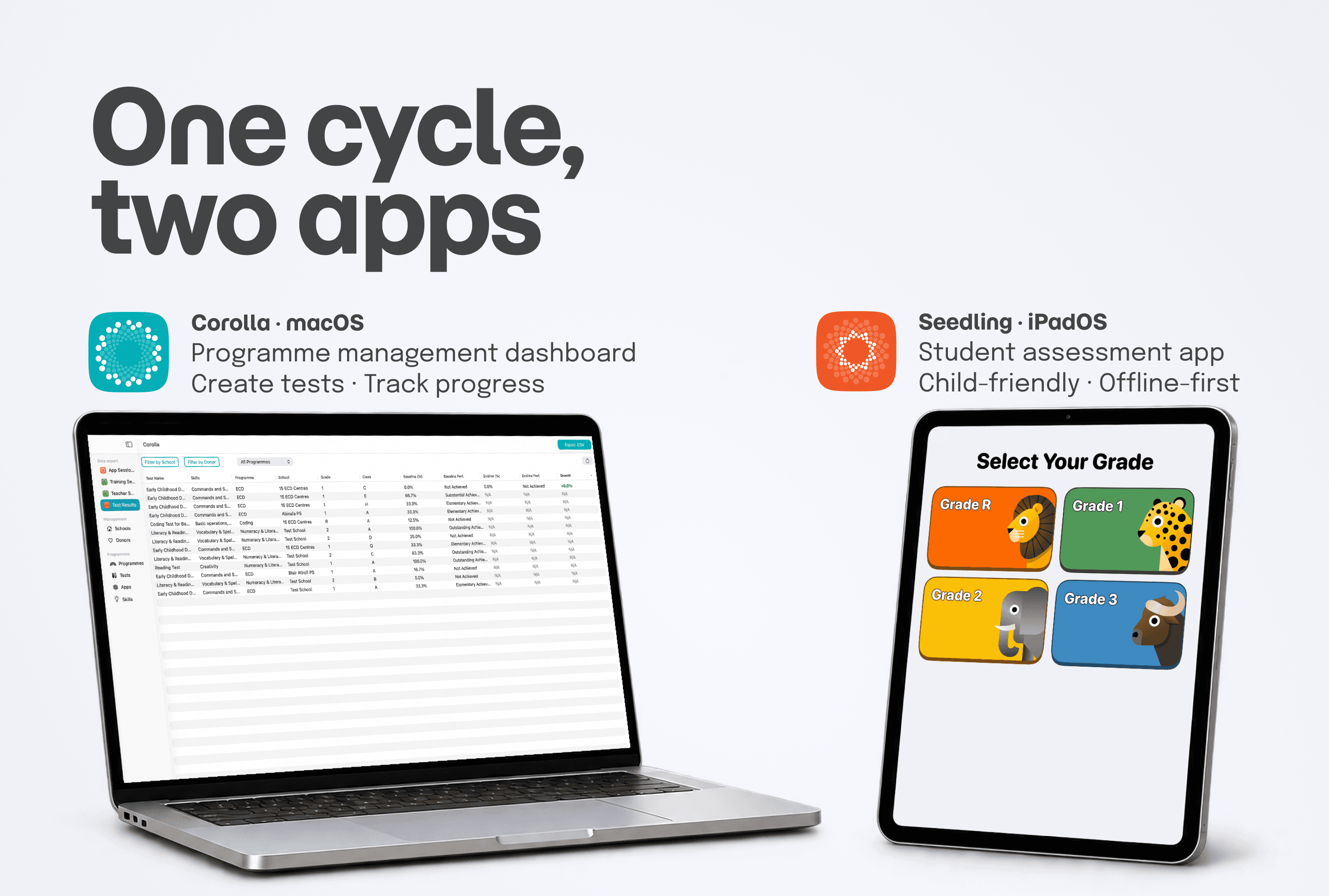
An assessment system on macOS (Corolla) and iPadOS (Seedling), designed for those who create the tests and for the children who take them.
- Role
- Product Designer
- Client
- iSchoolAfrica (South Africa)
- Year
- 2026
The problem
iSchoolAfrica is a South African NGO that improves education through technology: it gives partner schools iPads and trains teachers to use them in class. To monitor the programmes, Programme Managers rely on the Protea Suite, which collects the data into a single dashboard: Corolla.
The Suite covered teacher training and the PMs’ work, but not the most important piece: student progress. Assessments lived on paper, filled in by pen, recorded by hand, sometimes lost entirely. And when they survived they weren’t comparable: every school, programme and year produced a different format.
Measuring a single student’s progress between an entry and an exit test was hard; comparing schools or cohorts, impossible. The result: Programme Managers had no solid data to answer the question that mattered, is the programme working?

The solution
We designed the two halves of a single cycle.
Test Creation on Corolla (macOS). A new feature inside the dashboard PMs already use every day: they author the tests and publish them to the central database, from which they become immediately available to schools.
Seedling (iPadOS). The app students use to complete the tests, on their own and even offline: results sync as soon as the network returns and appear in Corolla, ready for analysis and reporting.
A circular flow: a test is born on a Mac in Johannesburg, completed on an iPad anywhere in South Africa, and comes back as structured data to those who need to prove the programme’s impact.


The process
Everything that follows was designed inside the same constraints, set by the real context of South African schools: unstable or often absent connectivity, shared iPads of different generations, and a user base aged 5 to 18 (many of them, in the poorest areas, on the first electronic device of their lives). These weren’t challenges to solve once: they were the conditions of every decision.
Understandanalysis before Figma
Before designing a single screen, we analysed the existing paper tests, mapping for each exercise the type of interaction and the data it produced. That mapping became the foundation of the whole system: the question types on Corolla, the matching screens on Seedling, the data structure in the reports.
Set upthe structural decisions
Where to build Test Creation. A dedicated macOS app, or a feature inside Corolla? We chose integration: PMs already use Corolla as their operational hub, and a separate app would have fragmented their flow.
Working without a network. Where there is no connection, an online test can’t run. Rather than a limit to work around, it became a design principle: an offline-first architecture. The test runs on the device, results are saved locally and sync on their own when the network returns.
How Mac should a Mac app be? The macOS Human Interface Guidelines describe dense interfaces (sidebars, toolbars, multiple windows) built for power users. Our PMs weren’t: for them the Mac is an occasional tool. The guidelines weren’t wrong, they assumed a different user than ours. We kept platform consistency where it mattered and simplified where desktop conventions would have weighed: a system of cards, one action at a time, a clear hierarchy.
Buildthe experience, app by app
Inside each app, dozens of choices. Two tell how we worked.
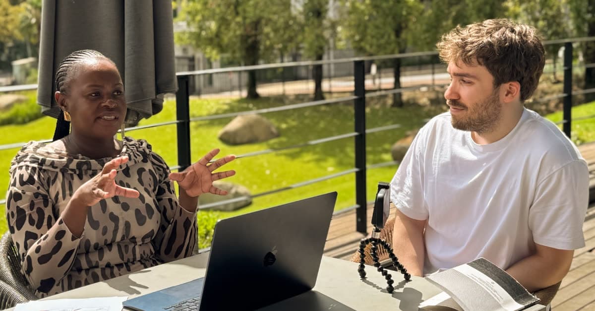
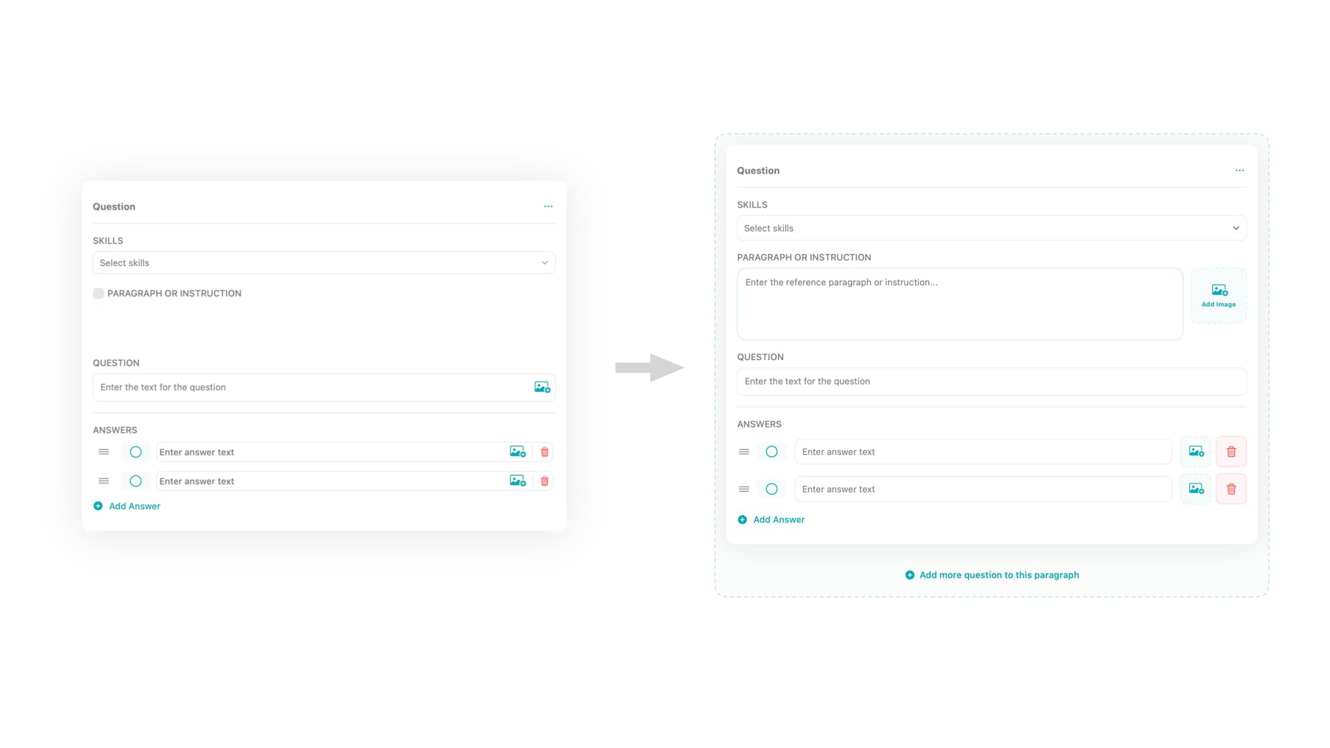
On Corolla: the structure of a question. Three elements: an optional Paragraph (the shared context), the question, the answers. The Paragraph wasn’t in the initial design: it emerged from real use, when two PMs translating their tests found themselves rewriting the same introductory text for every question, or dropping it and losing the context. A gap visible only by putting the product in the hands of the people who use it, closed with a field that mirrors the paper format they already knew.
On Seedling: setting up a whole class. A teacher would have had to configure 20-30 shared iPads alone: unmanageable. We flipped the problem, the students do the setup. But for a child who can’t yet read it took an orientation that didn’t depend on text.
The answer is a system of redundant visual anchors: every option is identified together by a label, a unique colour and an illustrated animal. The logic is cognitive, not graphic: the youngest programmes use primary colours a 5-year-old can already name (Numeracy = red), and the animal adds a channel independent of colour, essential with colour vision deficiencies. The teacher guides by voice ("select red", "select the zebra") and each student completes the setup alone.
Prototyping to decide
Twice a design question couldn’t be solved on paper, nor simulated in Figma. In both cases I built the alternatives as working prototypes in Xcode, with AI assistance.
First case: Question Groups. How to group several questions that share the same Paragraph? Design A treated the group as a question type of its own: easier to spot, but conceptually wrong, because a group is a relationship, not a type. Design B kept each question single, with the option to link it to the Paragraph: correct, but nested and less discoverable. Tested remotely: even with Design B the PMs completed everything without getting stuck. With usability equal, conceptual correctness won.
Second case: Matching. Connecting related items, a word to its definition: drag, or tap in sequence? Drag and drop is direct and tactile; tap-to-select is simpler and, in theory, more accessible to children with little gesture experience. But the question wasn’t how the interaction looks: it was how it feels, where Figma is mute and a prototype speaks.
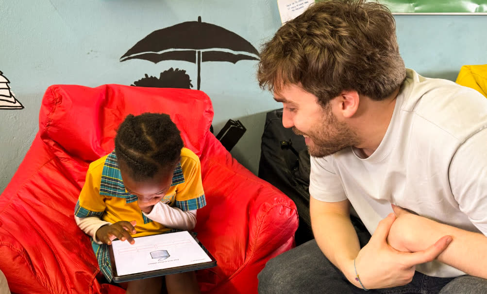
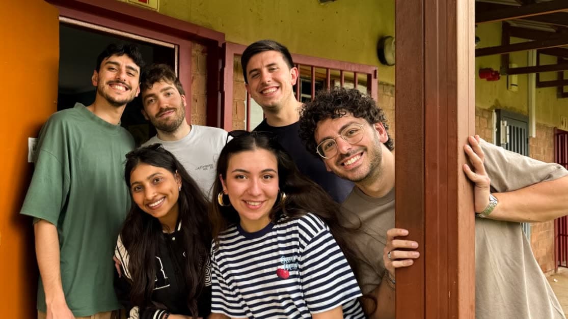
We took them to Johannesburg, to 7-8 year olds at Salvazione Christian School and Igugu Primary School in Soweto. At that age you can’t ask whether an interaction is "intuitive": you observe where they hesitate, where they slip, when they stay with the task.
The result was clear: drag and drop, the more demanding interaction in motor terms, turned out to be more intuitive: fewer errors, more engagement, longer attention. Tap-to-select worked, but felt mechanical. Physical directness mattered more than structural simplicity, and became the matching model, decided before writing a single line of production code.
from simulated to real: how AI changed my design workflow in just a few months
An in-depth reflection on how AI-driven code tools reshaped my creative approach, using the development of Seedling and Corolla for the Protea Suite as a concrete example.
Validation
Validation happened in the field, in Johannesburg, in March 2026: three days of testing across three very different schools.
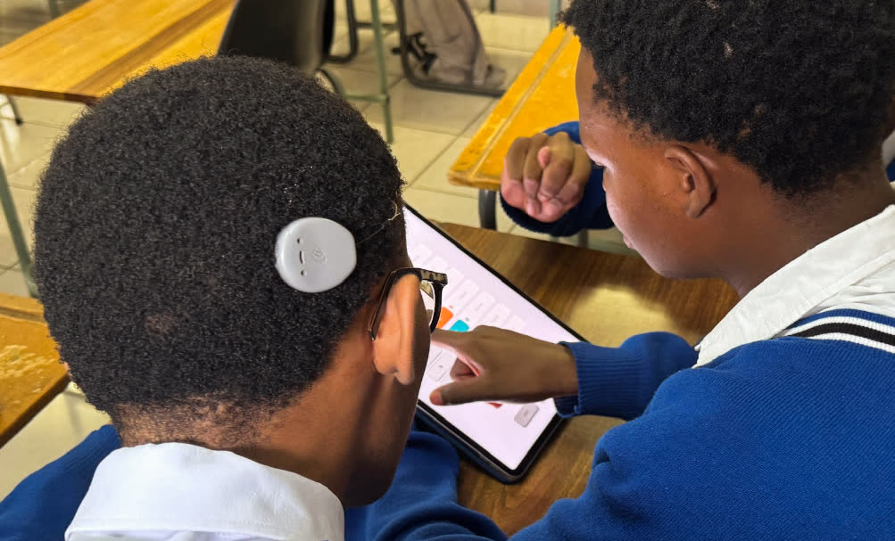
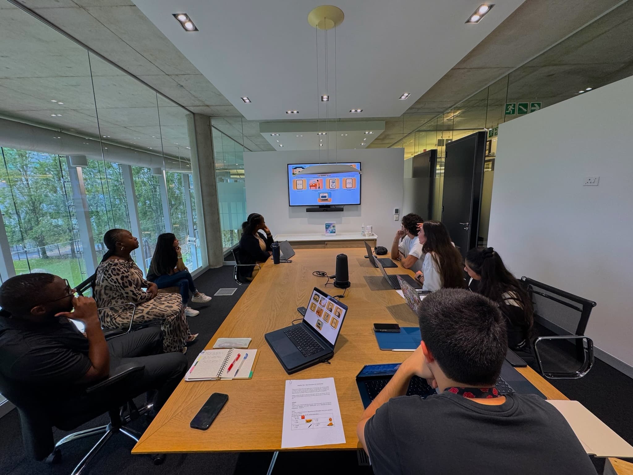
Around 100 learners completed the tests on Seedling on their own (Salvazione Christian School, Igugu Primary School, St. Vincent School for the Deaf). Four Programme Managers created tests on Corolla without assistance, describing the flow as intuitive and immediately useful.
Behind the numbers: the PMs, working on their real content, surfaced the gap that mattered, the Paragraph, integrated and re-validated before deploy. The children followed the verbal instructions based on colours and animals without difficulty. Drag and drop won the head-to-head on the ground.
And an unplanned result: at St. Vincent School for the Deaf, students with specific communication needs completed the test independently, the visual approach held beyond the perimeter it was built for.
Deploy, in June 2026, ships a product already validated by the very users it was designed for.
Learnings
No prototype simulates the variability of a real user. I knew it in theory; Johannesburg made me understand it in practice. Testing on the same trip with 6-year-olds, deaf students, teachers and Programme Managers taught me to observe before interpreting, and to build sessions that produce usable insight.
The more time you spend understanding the problem, the fewer iterations you waste on the solution. Mapping the paper tests avoided choices we would have had to dismantle months later: when in March the PMs translated their tests without friction, it was September’s work paying off.
Planning over a year is a skill, not a calendar. My first full product cycle, in a cross-functional team with real Scrum: consistency between September’s decisions and March’s implementations, a roadmap adapted to the unexpected, dependencies between design and development made explicit.
Next Project